More than Just a Logo
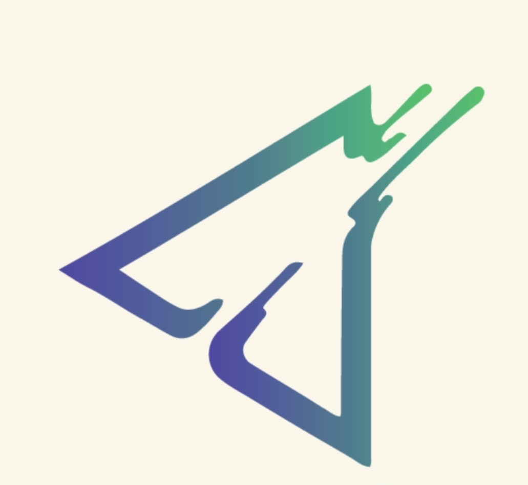
More Than Just a Logo A logo is never just a logo. At least, not to us. Every brand has colours, shapes, fonts, and design choices. But the best logos? They carry meaning. They tell a story. Our logo was designed to represent something much bigger than an app. It represents the spirit of entrepreneurship. The symbol itself originates from the symbol for fire. And that felt right immediately. Because if you’ve ever built something from nothing, you understand fire. Fire is passion. Fire is energy. Fire is grit. Fire is courage. Fire is resilience. And every entrepreneur - especially every small business owner - carries that fire inside them. Starting your own business isn’t easy. It means choosing uncertainty over comfort. It means risking failure. It means betting on yourself when there are no guarantees. It means having the courage to say: “I’m going to build this.” That takes serious guts. In proper South African terms? You need a bit of madness… and a lot of courage. That fire is what we wanted to honour. Because Fynd exists for people brave enough to carve their own path. The logo is also built around a triangle shape. That wasn’t accidental. Triangles are known as one of the strongest and most stable shapes in existence. Architecturally, structurally, symbolically - triangles represent strength. Strength under pressure. Strength through challenge. Strength through adversity. That matters because entrepreneurship demands exactly that. Business owners get tested constantly. Slow months. Difficult clients. Unexpected expenses. Rejection. Setbacks. But they keep going. That strength is at the heart of Fynd. Then there are the colours. We chose colours that feel modern, clean, professional, and trustworthy. Because that reflects the platform we’re building. Fynd is designed to feel fresh and exciting - but also reliable. Innovative - but credible. Bold - but professional. And then there’s the gradient. Yes, it looks great. But it also means something. We deliberately chose an ombré rather than a single flat colour because no one colour could ever represent who we are. Fynd isn’t one industry. It isn’t one type of business. It isn’t one kind of person. We are many things. And that’s the point. We’re proudly South African. The Rainbow Nation. A country built from extraordinary diversity. Different backgrounds. And somehow, all of it works together to create something powerful. That’s what the gradient represents. Movement. Diversity. Inclusion. Evolution. Growth. A blend of people, skills, services, and ambitions - all existing within one ecosystem. That ecosystem is Fynd. We also wanted colours that stand out. Something instantly recognisable. Something memorable. Because strong brands aren’t forgettable. They leave a mark. And we want Fynd to be exactly that. Recognisable. Trusted. Respected. Proudly ours. So yes - it’s a logo. But it’s also a statement. A statement about who we are. A statement about who we serve. And a statement about what we believe. We believe in entrepreneurs. We believe in small businesses. We believe in courage. We believe in hustle. And above all… We believe in the fire it takes to build something meaningful. That fire is Fynd.
Different cultures.
Different stories.
Different businesses.
Different dreams.